
Matching cookware to kitchen decor is the deliberate process of selecting cookware materials, colors, and finishes that align with and reinforce your kitchen’s overall design theme. The goal is not a perfect match but a cohesive visual intention where every piece on display feels like it belongs. Brands like Le Creuset, Caraway, and brushed stainless lines from All-Clad have made this easier by offering cookware in curated color palettes built for modern kitchens. Whether your kitchen leans industrial, farmhouse, or Scandinavian minimalist, your cookware can either anchor the design or undermine it. This guide covers how to choose the right finishes, display pieces without clutter, coordinate colors with your cabinetry, and keep your collection looking sharp year after year.
How to match cookware to kitchen decor by material and finish
Designers recommend matching cookware materials to kitchen themes as the foundation of visual harmony. The finish on your cookware carries as much visual weight as the color of your cabinets. Getting this right means fewer pieces doing more design work.
Finishes for modern and industrial kitchens
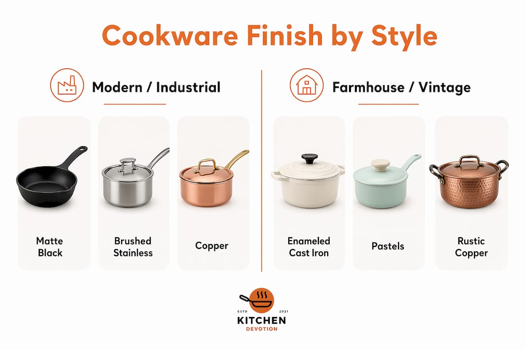
Matte black, brushed stainless, and copper finishes are the strongest choices for modern and industrial kitchens. Matte black cookware, like the kind offered by Caraway or the T-fal hard anodized line, reads as intentional and graphic against white subway tile or concrete countertops. Brushed stainless from brands like All-Clad or Cuisinart holds its own in kitchens with chrome fixtures and open shelving. Copper adds warmth and texture without softening the industrial edge, especially when polished and displayed on a wall rack.
Finishes for farmhouse, boho, and vintage kitchens
Enameled cast iron and pastel cookware are the natural fit for farmhouse, boho, and vintage-inspired kitchens. Le Creuset’s Dutch ovens in Marseille blue, Cerise red, or Sage green act as color anchors when placed on open shelves or stovetops. Caraway’s ceramic-coated sets in Sage, Perracotta, and Cream coordinate directly with the warm wood tones and linen textures common in farmhouse design. The key is choosing one or two colors from the brand’s palette that echo a dominant tone already present in your kitchen.
The principle of cohesive intention
Homeowners often believe cookware must match perfectly, but experts recommend aiming for cohesive intention instead. Cohesive intention means your cookware shares an undertone or material family with your kitchen rather than matching it exactly. A matte black skillet does not need to match a black faucet precisely. Both just need to belong to the same visual temperature, which in this case is cool and graphic.
- Match matte black or dark gray cookware to kitchens with black hardware, dark grout, or charcoal cabinetry.
- Use copper or brass-toned cookware to complement warm wood cabinets, gold fixtures, or terracotta tile.
- Choose enameled pastel pieces for kitchens with white shaker cabinets, butcher block countertops, or woven textures.
- Pair brushed stainless cookware with chrome or nickel fixtures and quartz or concrete countertops.
- Avoid mixing warm and cool metal finishes in the same display zone unless one finish is clearly dominant.
Pro Tip: Test your cookware under both natural daylight and your kitchen’s artificial lighting before committing. Lighting alters undertones significantly, and a copper pot that looks warm at noon can read orange under warm LED bulbs at night.
What are the best ways to display cookware as kitchen decor?
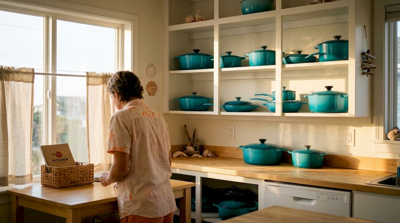
Displaying cookware on open shelving or wall racks can increase usable cabinet storage by 20–30%. That is a practical gain, but the visual benefit is equally significant. Cookware on display turns functional objects into design elements.
Open shelving and wall-mounted pot racks
Open shelving works best when cookware is grouped by finish or material rather than by size alone. A row of matte black skillets in graduated sizes reads as a deliberate collection. A mix of stainless, nonstick, and enameled pieces on the same shelf reads as overflow. Wall-mounted racks, like the classic ceiling-hung grid style or a simple horizontal rail, keep cookware accessible and off the counter without crowding the visual field.
Ceiling-mounted pot racks and height placement
Height placement of hanging pot racks critically affects both accessibility and visual balance. A rack hung too low creates a cramped, heavy feeling and blocks sightlines across the kitchen. The standard recommendation is to hang pot racks so the lowest hanging piece clears your head by at least six inches when you stand at the stove. Ceiling-mounted racks work especially well in kitchens with high ceilings, where the vertical space would otherwise feel empty.
The stovetop statement method
The stovetop statement uses a single, high-quality cookware piece as the kitchen’s design anchor. One beautiful Le Creuset Dutch oven or a polished copper saucepan left on the stovetop does more for a kitchen’s look than a full rack of mismatched pots. This method works because it keeps the stovetop area clean while giving the eye a clear focal point.
Here is a quick comparison of the three main display methods:
| Display method | Best for | Visual effect | Storage gain |
|---|---|---|---|
| Open shelving | All kitchen sizes | Curated, gallery-like | Moderate |
| Wall or ceiling rack | Medium to large kitchens | Dramatic, sculptural | High |
| Stovetop statement | Any kitchen size | Focused, editorial | None |
- Choose one display method as your primary approach and commit to it.
- Group cookware by finish or material within that display zone.
- Remove any piece that is scratched, discolored, or visually out of place.
- Leave deliberate negative space between pieces to avoid a cluttered look.
- Rotate seasonal or less-used pieces into cabinet storage to keep the display fresh.
Pro Tip: Copper pots displayed intentionally act like accent pieces and anchor vertical wall space without cluttering countertops. Even one polished copper piece in an otherwise stainless kitchen creates warmth and contrast.
How do you coordinate cookware colors with kitchen colors?
Cookware becomes decor only when it complements your kitchen’s color palette and is displayed with purpose. Color coordination starts with identifying the dominant undertone of your kitchen, either warm or cool, and choosing cookware that shares that undertone.
Warm versus cool kitchen undertones
Warm kitchens feature wood cabinets, brass or gold hardware, terracotta or cream tile, and marble with gold veining. These kitchens pair best with copper, enameled cast iron in earthy tones like Le Creuset’s Nectar or Meringue, or matte finishes in warm neutrals. Cool kitchens feature white or gray cabinetry, chrome or nickel hardware, and quartz or concrete surfaces. These spaces work well with brushed stainless, matte black, or Caraway’s Navy and Periwinkle colorways.
Coordinating with specific kitchen materials
- Wood cabinets: Pair with copper, brass-toned, or warm-enameled cookware to reinforce the organic warmth.
- Marble countertops: Use white, cream, or soft gray enameled cookware to echo the stone’s veining without competing with it.
- Brass hardware: Match with copper or gold-toned cookware for a tonal, layered look rather than an exact match.
- White shaker cabinets: Almost any finish works, but matte black and pastel enameled pieces create the strongest visual contrast.
- Concrete or industrial surfaces: Brushed stainless and matte black are the most natural partners.
The Rule of Three and tonal families
The Rule of Three groupings create cohesive cookware arrangements by limiting the number of distinct finishes on display. Grouping all copper, all matte black, or all enameled pieces in one color family prevents the visual noise that comes from mixing metals haphazardly. Tonal families work the same way: a display of Caraway’s Sage, Cream, and Perracotta reads as a curated palette because all three share warm, muted undertones.
| Kitchen style | Recommended cookware finish | Example brand or line |
|---|---|---|
| Industrial | Matte black, brushed stainless | Caraway, All-Clad |
| Farmhouse | Enameled cast iron, pastel ceramic | Le Creuset, Caraway |
| Scandinavian | White or light gray enamel, stainless | Le Creuset, Cuisinart |
| Boho or eclectic | Copper, terracotta-toned enamel | Le Creuset, vintage copper |
| Modern minimalist | Matte black, dark stainless | T-fal, All-Clad |
How to curate and maintain cookware for display and function
Overstuffing cabinets with mismatched cookware creates visual chaos. Practitioners advise displaying only attractive, well-maintained pieces and storing the rest out of sight. Curation is the discipline that separates a kitchen that looks designed from one that looks accumulated.
Build a curated collection, not an accumulated one
The most effective approach is to choose cookware materials with both function and display in mind from the start. Buy fewer pieces of higher quality rather than filling every cabinet with budget sets that degrade quickly. A seven-piece set in a consistent finish will always look more intentional than fourteen mismatched pieces from four different brands.
- Audit your current cookware and remove anything scratched, warped, or discolored from visible display zones.
- Keep only pieces that share a finish or color family in your open display areas.
- Store specialty or seasonal cookware, like a large roasting pan or a fish poacher, in a lower cabinet or pantry.
- Use stackable cookware sets, such as the CAROTE nonstick line, for small kitchens where vertical cabinet space is limited.
- Organize displayed pieces by both visual appeal and frequency of use so the most-used items are also the most visible.
Cleaning and maintenance for display-ready cookware
Cookware that lives on display needs more frequent cleaning than cookware stored in cabinets. Grease and dust accumulate on exposed surfaces and dull finishes quickly. Copper pieces require polishing with a copper cleaner like Bar Keepers Friend to maintain their reflective warmth. Enameled cast iron from Le Creuset should be hand-washed and dried immediately to prevent water spots on the enamel. Stainless steel benefits from a quick wipe with a microfiber cloth and a small amount of mineral oil to restore its sheen between uses.
Pro Tip: Storing cookware properly between uses prevents scratches that make pieces look worn. Use pan protectors between stacked pieces and hang lids separately to avoid chipping enamel edges.
Key Takeaways
Matching cookware to kitchen decor requires selecting finishes that share your kitchen’s dominant undertone, displaying pieces with deliberate grouping, and maintaining only attractive pieces in visible zones.
| Point | Details |
|---|---|
| Match finish to kitchen style | Use matte black or stainless for modern kitchens; use enameled pastels for farmhouse or boho styles. |
| Aim for cohesive intention | Cookware does not need to match exactly; it needs to share undertones with your kitchen’s dominant palette. |
| Display with the Rule of Three | Group cookware by finish or color family to prevent visual clutter on shelves or racks. |
| Use the stovetop statement | One high-quality focal piece on the stovetop anchors the kitchen’s design without requiring a full display set. |
| Curate and maintain regularly | Remove worn or mismatched pieces from display zones and clean exposed cookware more frequently than stored pieces. |
Why I think most homeowners are getting this backwards
Most people buy cookware for cooking first and think about how it looks in the kitchen as an afterthought. I understand that instinct, but it produces kitchens that feel unfinished even when everything is technically functional. The cookware is the most visible category of kitchen equipment. It sits on the stove, hangs on the wall, and lines the shelves. Treating it as purely utilitarian is a missed opportunity.
What I have found actually works is starting with the kitchen’s existing palette before buying a single new piece. If your cabinets are warm white with brass pulls, you already have your answer: copper or warm-toned enamel. If your countertops are cool gray quartz, brushed stainless or matte black will feel native rather than forced. The cookware should feel like it grew out of the kitchen, not like it was added to it.
The other thing most guides skip is the maintenance reality. Copper looks extraordinary on a wall rack for about three weeks before it needs polishing. Enameled cast iron chips if you hang it carelessly. Matte black shows fingerprints. None of these are dealbreakers, but you need to choose a finish you are willing to maintain. A well-polished copper pot is a design statement. A tarnished one is just clutter with ambition.
My honest recommendation is to pick one finish family, buy the best quality you can afford within that family, and display only what you actually use. A stylish kitchen tools checklist can help you identify which pieces earn their place on display versus which ones belong in a drawer. The kitchens that look the most intentional are almost always the ones with the fewest pieces showing.
— K. Connors
Kitchendevotion’s cookware picks for every kitchen style
Kitchendevotion curates cookware sets chosen specifically for homeowners who want both performance and visual appeal in the same piece.

Whether you are building a farmhouse kitchen around Le Creuset’s enameled palette or outfitting a modern space with a sleek nonstick set, Kitchendevotion’s cookware sets collection covers the full range of finishes and styles covered in this guide. The site also offers a practical guide on kitchen organization for small spaces for homeowners who want to display cookware without sacrificing storage. Every product is selected to balance daily cooking performance with the kind of appearance that holds up on an open shelf or stovetop.
FAQ
What does it mean to match cookware to kitchen decor?
Matching cookware to kitchen decor means selecting cookware finishes, colors, and materials that share the dominant undertone or style of your kitchen. The goal is cohesive visual intention rather than an exact color match.
Which cookware finish works best for a modern kitchen?
Matte black and brushed stainless are the strongest finishes for modern kitchens. Both complement chrome or nickel hardware, concrete countertops, and white or gray cabinetry without competing for attention.
How do I display cookware without making my kitchen look cluttered?
Group cookware by finish or color family using the Rule of Three principle, and limit visible pieces to those that are attractive and well-maintained. Remove worn or mismatched pieces from open display zones entirely.
Can copper cookware work in a non-traditional kitchen?
Yes. Polished copper acts as an accent piece and adds warmth and texture even in modern or industrial kitchens. One or two copper pieces displayed on a wall rack create contrast without overwhelming a cool-toned palette.
How often should I clean cookware that is on display?
Cookware on open shelves or racks collects grease and dust faster than stored pieces and should be wiped down at least once a week. Copper requires periodic polishing, and enameled cast iron should be hand-washed and dried immediately after each use to stay display-ready.





No comment