
Kitchen color coordination is the intentional process of aligning cabinets, countertops, walls, lighting, and accents into a unified palette that shapes both how a kitchen looks and how it functions. Get it right, and the space feels effortless. Get it wrong, and even expensive materials feel disjointed. The role of kitchen color coordination goes far beyond personal preference. It governs mood, spatial perception, and daily usability. In 2026, with biophilic palettes and earthy tones dominating professional recommendations, understanding the principles behind color coordination has never been more relevant for homeowners planning a kitchen update.
How does the 60-30-10 color rule apply to kitchen design?
The 60-30-10 color rule is the most reliable framework for building a balanced kitchen color scheme, and interior designers apply it consistently across every style from farmhouse to minimalist. The rule divides color responsibility into three zones: 60% dominant, 30% secondary, and 10% accent. Each zone maps directly to specific kitchen surfaces, which makes it a practical workflow rather than an abstract theory.
Breaking down the three color zones
The dominant 60% covers the surfaces with the largest visual footprint. In most kitchens, that means upper and lower cabinetry plus the main wall color. This zone sets the tone for the entire room, so neutrals like warm white, sage green, or greige work well here because they provide a stable visual base without competing with everything else.

The secondary 30% covers countertops, kitchen islands, and sometimes a contrasting lower cabinet color in two-tone designs. This is where you introduce depth and contrast. A warm white upper cabinet paired with a charcoal or deep navy island is a classic 60-30 application. The secondary color should complement the dominant without matching it exactly.
The accent 10% covers fixtures, hardware, backsplash tile, pendant lights, and decorative objects. This is where personality enters the room. A matte black faucet, a terracotta tile backsplash, or brass cabinet pulls each qualify as accent elements. The 10% limit keeps these choices from overwhelming the space.
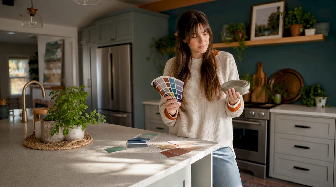
Pro Tip: Map your three color zones onto a physical sketch of your kitchen before purchasing anything. Assign a color swatch to each zone and view them together under your kitchen’s actual lighting conditions. This single step prevents the most common coordination mistakes.
The table below shows how the 60-30-10 breakdown translates to typical kitchen components:
| Color zone | Proportion | Typical kitchen elements |
|---|---|---|
| Dominant | 60% | Upper cabinets, lower cabinets, main wall color |
| Secondary | 30% | Countertops, kitchen island, contrasting cabinet color |
| Accent | 10% | Hardware, backsplash, fixtures, pendant lights, decor |
Proportional color zone mapping aligns naturally with how kitchens are physically structured, which is why the rule translates so cleanly from theory to practice. Kitchens with clearly defined dominant, secondary, and accent zones consistently read as more polished than those where color is applied without proportion in mind.

What are the essential kitchen color palettes trending in 2026?
The NKBA’s 2026 Kitchen Trends Report shows that earthy green tones are the top kitchen color choice, favored by 86% of design professionals, followed by blues at 78% and browns at 67%. These numbers reflect a broader shift toward biophilic design, where color choices draw from nature to create calm, grounded environments. This is not a passing aesthetic trend. It reflects how homeowners now think about the kitchen as a restorative space, not just a work zone.
The 2026 palette story breaks down into four clear directions:
- Earthy greens and sage. Colors like olive, sage, and forest green dominate cabinet choices because they read as both warm and neutral depending on the lighting. They pair naturally with wood tones, stone countertops, and brass hardware.
- Blues from slate to navy. Blue kitchens work because the color reads as calm and focused, which suits a space where people spend concentrated time. Slate blue works as a dominant cabinet color, while deeper navy performs best as a secondary island or lower cabinet tone.
- Warm neutrals replacing stark white. Cashmere and warm greige tones are replacing the cold, bright whites that defined kitchens for the past decade. These warmer neutrals pair more naturally with wood, stone, and matte finishes, creating a cohesive rather than clinical feel.
- Bold accents, not bold walls. Accent colors applied sparingly on islands, backsplashes, or selected cabinets introduce character without overpowering the room. Terracotta, deep burgundy, and rich ochre appear as backsplash tile or island colors rather than all-surface applications.
Homeowners embracing earthy biophilic palettes in 2026 are responding to a genuine need for kitchens that feel restorative rather than stimulating. The shift away from high-contrast, all-white kitchens toward layered, nature-inspired tones reflects a deeper change in how people relate to their cooking spaces.
How do lighting and material coordination affect kitchen color perception?
Color coordination is less about the paint chip in your hand and more about how colors behave under lighting and against specific materials. This is the insight most homeowners miss, and it explains why a cabinet color that looked perfect in the showroom can appear muddy or cold once installed. Lighting changes everything, including undertones, sheen, and the apparent warmth of a finish.
The most common and expensive coordination mistake happens when cabinets, countertops, and lighting are chosen separately rather than together. A warm cream cabinet can develop a yellow cast under cool LED lighting. A gray countertop can shift toward purple under warm incandescent bulbs. These shifts are predictable and preventable, but only if you test materials together before committing.
Key principles for lighting and material coordination:
- Use a 3000K color temperature for kitchen lighting. Layered lighting at 3000K (warm white) balances functional brightness with an inviting feel and keeps warm palette colors from looking washed out or overly yellow.
- Layer ambient, task, and accent lighting. Ambient lighting sets the overall tone. Task lighting under cabinets reveals the true color of countertops and backsplash. Accent lighting highlights specific materials and textures. All three layers together create the lighting environment your color palette actually lives in.
- Match finish sheen to the room’s light level. High-gloss finishes amplify light and make colors appear brighter and cooler. Matte finishes absorb light and make the same color appear warmer and softer. In a north-facing kitchen with limited natural light, matte finishes on warm-toned cabinets will read more accurately than high-gloss options.
- Test samples under both daylight and artificial light. A sample that looks balanced in afternoon sun may shift dramatically under evening kitchen lighting. Reviewing samples together under real conditions is the single most reliable way to catch undertone mismatches before installation.
Pro Tip: Tape large samples of your cabinet finish, countertop material, and backsplash tile directly onto your kitchen surfaces at the same time. Live with them for at least three days across different times of day and lighting conditions before making a final decision.
Lighting standardization and layering unify a kitchen’s color story in a way that no amount of careful paint selection can replicate on its own. The lighting plan and the color plan must be developed together.
What practical steps can homeowners take to coordinate kitchen colors?
Coordinating kitchen colors effectively requires a structured approach. Treating it as a series of isolated decisions, choosing cabinets one week and countertops the next, produces kitchens that feel “off” despite attractive individual choices. Ignoring the relationships between fixed materials is the root cause of most coordination failures.
Follow these steps to build a coherent kitchen color scheme from the start:
- Start with your cabinet color as the dominant anchor. Cabinets occupy the most visual space in any kitchen. Choose this color first and let every other decision respond to it. If you commit to sage green cabinets, your countertop, backsplash, and hardware choices all have a clear reference point.
- Choose a contrasting secondary color for countertops and the island. The secondary color should create visible contrast with the dominant without clashing. Warm wood tones against sage green, or white quartz against navy blue, are examples where contrast creates depth rather than tension.
- Assign accent colors last and limit them to two. Hardware finish, backsplash tile, and pendant light style all carry color. Choosing two accent tones, such as brass and terracotta, and repeating them across multiple elements creates cohesion. Three or more competing accent colors produce visual noise.
- Map all colors to physical zones before purchasing. Draw a simple floor plan and label each surface with its assigned color zone. This exercise reveals imbalances before they become expensive mistakes.
- Avoid approving samples in isolation. A countertop sample viewed alone on a white table tells you almost nothing about how it will look next to your cabinet color under your kitchen’s lighting. Always evaluate samples in context.
- Balance saturation across zones. If your dominant cabinet color is highly saturated, such as deep forest green, keep the secondary and accent colors more neutral. If your dominant color is a soft neutral, the secondary and accent zones can carry more color without overwhelming the space.
How does color psychology influence kitchen mood and functionality?
Color psychology in kitchens is not a soft concept. Expert Chris Demant, cited by The Kitchn, states that color must support function and endurance, not just aesthetics. A kitchen designed for focused cooking requires different color decisions than one designed primarily as a social gathering space. The color choices you make directly shape how the room feels to work in every day.
Warm undertones in colors like terracotta, amber, and warm sage create energy and appetite, which is why these tones work well in kitchens where cooking is an active, engaged activity. Cool undertones in slate blue, gray-green, and soft white create calm and focus, which suits kitchens that double as homework stations or quiet morning spaces. The distinction between warm and cool undertones is more functionally significant than the choice of hue itself.
Feng shui principles, which many modern designers reference without labeling them as such, recommend avoiding neon or overly bright colors in kitchens because they create visual fatigue over time. The same principle appears in function-focused color selection: colors that feel exciting in a showroom often feel exhausting after six months of daily use. Restraint in saturation and contrast is not timidity. It is a design decision that prioritizes long-term livability over short-term impact.
Key takeaways
Effective kitchen color coordination requires applying the 60-30-10 rule across cabinets, countertops, and accents while testing all materials together under real lighting conditions.
| Point | Details |
|---|---|
| Apply the 60-30-10 rule | Assign 60% to cabinets and walls, 30% to countertops and islands, and 10% to hardware and accents. |
| Follow 2026 palette trends | Earthy greens, warm neutrals, and restrained bold accents define the most durable modern kitchen palettes. |
| Test materials together | Always review cabinet, countertop, and backsplash samples side by side under your kitchen’s actual lighting. |
| Use 3000K layered lighting | Warm white lighting at 3000K preserves color accuracy and creates an inviting atmosphere across all palette types. |
| Let function guide color mood | Choose warm undertones for active cooking spaces and cool undertones for calmer, multi-use kitchen environments. |
Why color coordination deserves your attention before anything else
Most homeowners treat color as the last decision in a kitchen renovation. Pick the cabinets, choose the countertops, select the appliances, then figure out what color to paint the walls. I have seen this sequence produce beautiful individual elements that collectively feel wrong, and it almost always comes down to the same problem. Color was treated as decoration rather than structure.
The most successful kitchen designs I have encountered start with a color story, not a product list. The palette comes first, and every material selection follows from it. This approach forces you to think about how sage green cabinets will read against a specific quartz countertop under a specific lighting temperature before you spend a dollar on either. That discipline saves money, prevents regret, and produces kitchens that feel intentional rather than assembled.
I also want to push back against the idea that following 2026 trends automatically produces a timeless kitchen. Earthy greens and warm neutrals are genuinely good choices right now, but they are good choices because they align with durable design principles, not because they are trending. A sage green cabinet works because it reads as both warm and neutral, pairs with a wide range of secondary materials, and holds up visually over years of daily use. Those qualities matter more than the trend report that named it the color of the year.
The practical takeaway is this: plan your color coordination before you plan anything else. Treat the 60-30-10 rule as a structural tool, test your materials together under real conditions, and choose colors that support how you actually use your kitchen. The aesthetics will follow.
— K
Bring your kitchen color vision to life with Kitchendevotion
Kitchendevotion is built for homeowners who think carefully about every element of their kitchen, including how the tools and appliances they choose fit the space they have designed. A well-coordinated kitchen deserves equally considered equipment. At Kitchendevotion, you will find curated guides and product recommendations that connect kitchen design thinking with practical cooking performance. If you are updating your kitchen in 2026, the 2026 appliance guide covers how to choose appliances that complement your color palette and material choices without compromising on function. Visit Kitchendevotion for kitchen inspiration that takes both style and usability seriously.
FAQ
What is the role of kitchen color coordination?
Kitchen color coordination is the process of intentionally aligning the colors of cabinets, countertops, walls, lighting, and accents to create a cohesive, functional space. It shapes mood, spatial perception, and how comfortable the kitchen feels to work in daily.
How does the 60-30-10 rule work in a kitchen?
The 60-30-10 rule assigns 60% of color to dominant surfaces like cabinets and walls, 30% to secondary surfaces like countertops and islands, and 10% to accents like hardware and backsplash tile. This proportion prevents visual chaos and creates a naturally balanced palette.
What are the best kitchen colors for 2026?
According to the NKBA 2026 Kitchen Trends Report, earthy greens are the top choice at 86% professional preference, followed by blues at 78% and browns at 67%. Warm neutrals like cashmere are also replacing stark whites as dominant cabinet and wall colors.
Why does lighting matter for kitchen color coordination?
Lighting changes how colors and materials appear by shifting undertones, altering sheen, and affecting the perceived warmth of finishes. Choosing cabinets, countertops, and lighting separately is the leading cause of expensive color mismatches in kitchen renovations.
How do I start coordinating my kitchen colors?
Start by choosing your cabinet color as the dominant anchor, then select a contrasting secondary color for countertops and the island, and assign accent colors last. Always review all material samples together under your kitchen’s actual lighting before making final decisions.


No comment